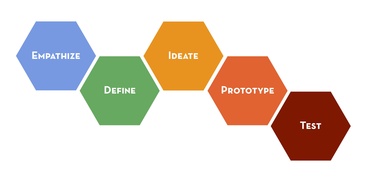
Photo Credit: dschool.stanford.edu
prototypE Selection
When originally considering the design for my documentation prototype, I narrowed down the tools to an internal website controlled by security group, a wiki-type page hosted by the Administrative Systems (AS) group, or updating the current FileShare structure for clarification purposes. I’ve included all three screenshots below to provide a snapshot of the possible resources.
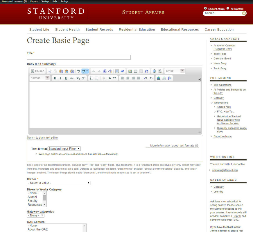

In analyzing the options, the internal website provided the most flexibility for design/layout, but also was a blank slate with no real direction in how we would organize our content. In addition, the pages would be integrated with departmental staff training pages, but not available for their view due to the security group level. The security group level is quite broad, and would have given access to roughly 30-40 users in our department. Plus, if a page is accidentally adjusted to the wrong security level/group, it could be viewable by Stanford staff, students and faculty. With the lack of structure and questionable security settings, I decided this would be a distant second option if necessary.
The second option, and one I ultimately decided on, was the development of a wiki-style portal on Confluence through the help of our technical Administrative Systems (AS) team. Currently, AS uses Confluence for systems processing and technical documentation regarding batch processes and report definitions. Coming from a systems background, I thought our team (Degree Progress) could piggy back on this portal and create our own page, to which AS obliged. I will go into further detail below on the design and benefits, but this structured portal provides us with a universal landing page for documentation behind two walls of security (Stanford sign-in and Confluence page restrictions), in addition to the ability to archive our documentation edits.
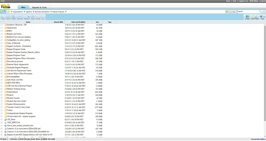
The final option was to reorganize our current FileShare structure to filter all documentation/training materials into one location. FileShare is essentially a user interface website (again limited by department security, not user security) that references our internal servers. While this approach would provide added benefit in regards to cleanup, it also leaves us still with using Word or Excel as our documentation application, which could result in the same situation we have now with outdated documentation or conflicting documentation due to the lack of an archive. I believe this option would really just be a short term band-aid fix, and doesn’t address the real issues at hand; all the while failing as a design enhancement for staff understanding.
Note: I also considered the development of videos via Camtasia, as the main resource for future staff training/documentation. However, the time and effort to film these videos with all of our other projects on our plate, lead me to conclude that the use solely of videos is not feasible. These videos can be integrated with the Confluence page down the road, if desired.
The second option, and one I ultimately decided on, was the development of a wiki-style portal on Confluence through the help of our technical Administrative Systems (AS) team. Currently, AS uses Confluence for systems processing and technical documentation regarding batch processes and report definitions. Coming from a systems background, I thought our team (Degree Progress) could piggy back on this portal and create our own page, to which AS obliged. I will go into further detail below on the design and benefits, but this structured portal provides us with a universal landing page for documentation behind two walls of security (Stanford sign-in and Confluence page restrictions), in addition to the ability to archive our documentation edits.
The final option was to reorganize our current FileShare structure to filter all documentation/training materials into one location. FileShare is essentially a user interface website (again limited by department security, not user security) that references our internal servers. While this approach would provide added benefit in regards to cleanup, it also leaves us still with using Word or Excel as our documentation application, which could result in the same situation we have now with outdated documentation or conflicting documentation due to the lack of an archive. I believe this option would really just be a short term band-aid fix, and doesn’t address the real issues at hand; all the while failing as a design enhancement for staff understanding.
Note: I also considered the development of videos via Camtasia, as the main resource for future staff training/documentation. However, the time and effort to film these videos with all of our other projects on our plate, lead me to conclude that the use solely of videos is not feasible. These videos can be integrated with the Confluence page down the road, if desired.
Prototype Design
As mentioned above, I chose the Confluence wiki page for the following reasons:
- Universal landing page for all Degree Progress documentation
- Simple ability to update and ‘archive’ prior documentation
- Dual level security based on Stanford sign-in and user specific permissions (meaning security can be granted to only my team members)
- A structured blank canvas with tools to upload screenshots, add text, and use columns as dividers for the images/text (less knowledge of HTML and simplification of tools/layout of the page)
- Track history and audit trail updates with the ability to see who made the edits and to revert to previous documentation pages (if an error is made, you can revert back to a previous edit to restore the documentation).
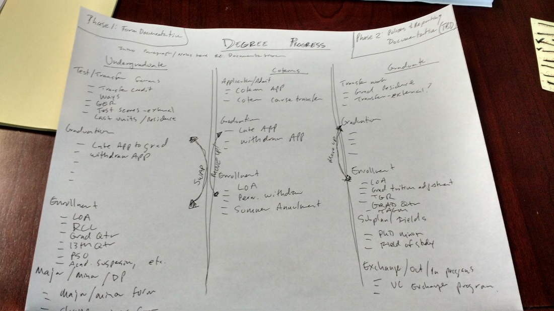
I then took my sketch mock-up and tried out the tools in Confluence to develop a design for our form documentation portal. I then added the three columns for each career we oversee (Undergraduate, Graduate and our Coterm students). Note: Coterm students are students pursuing an undergraduate degree who apply for a graduate degree at Stanford while completing their undergraduate requirements. Students can have both careers active and take courses towards both careers while at Stanford.
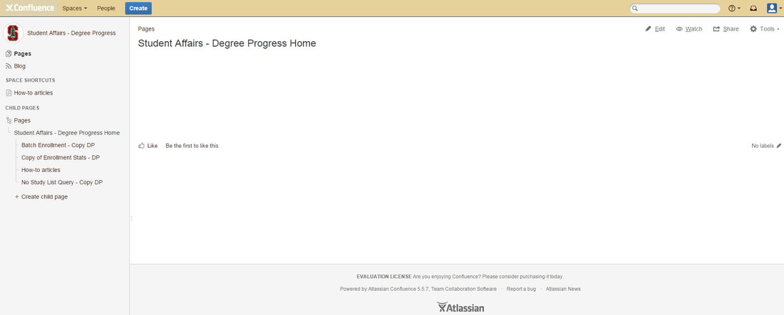
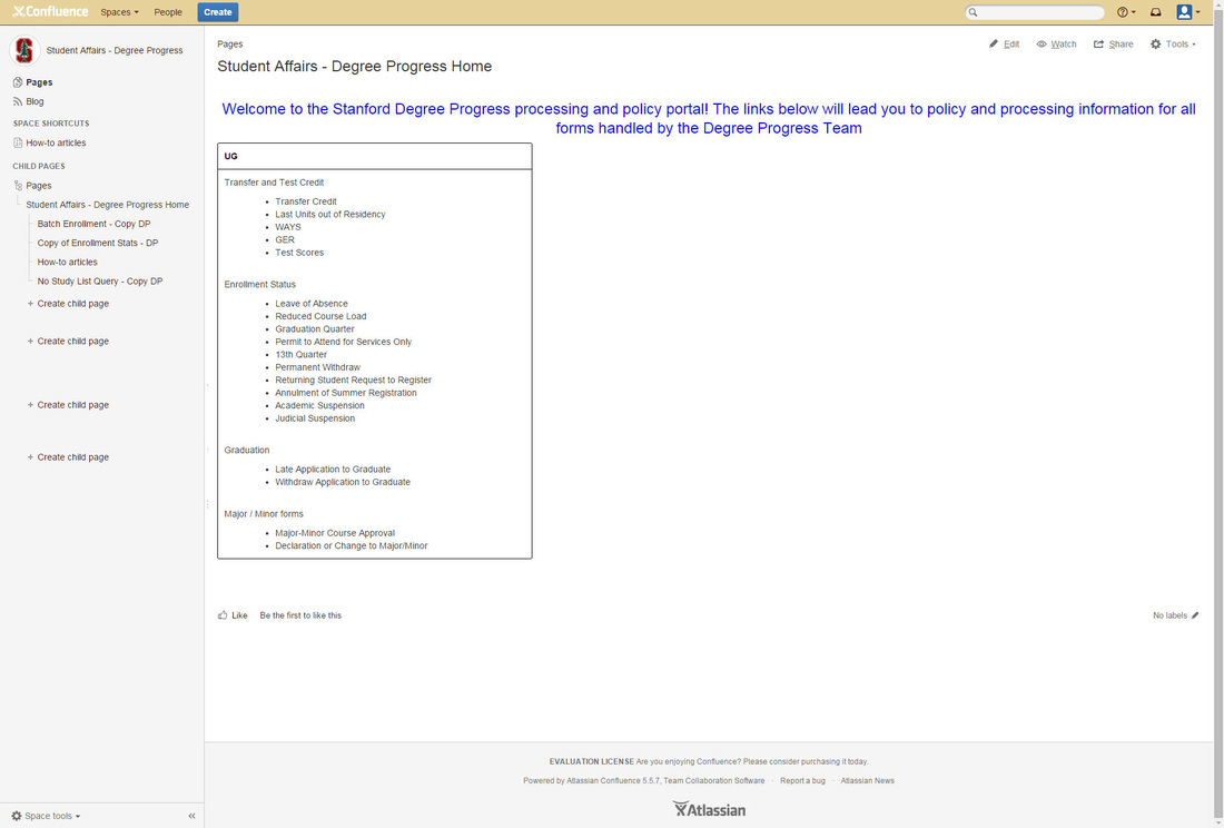
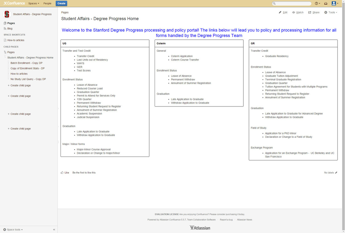
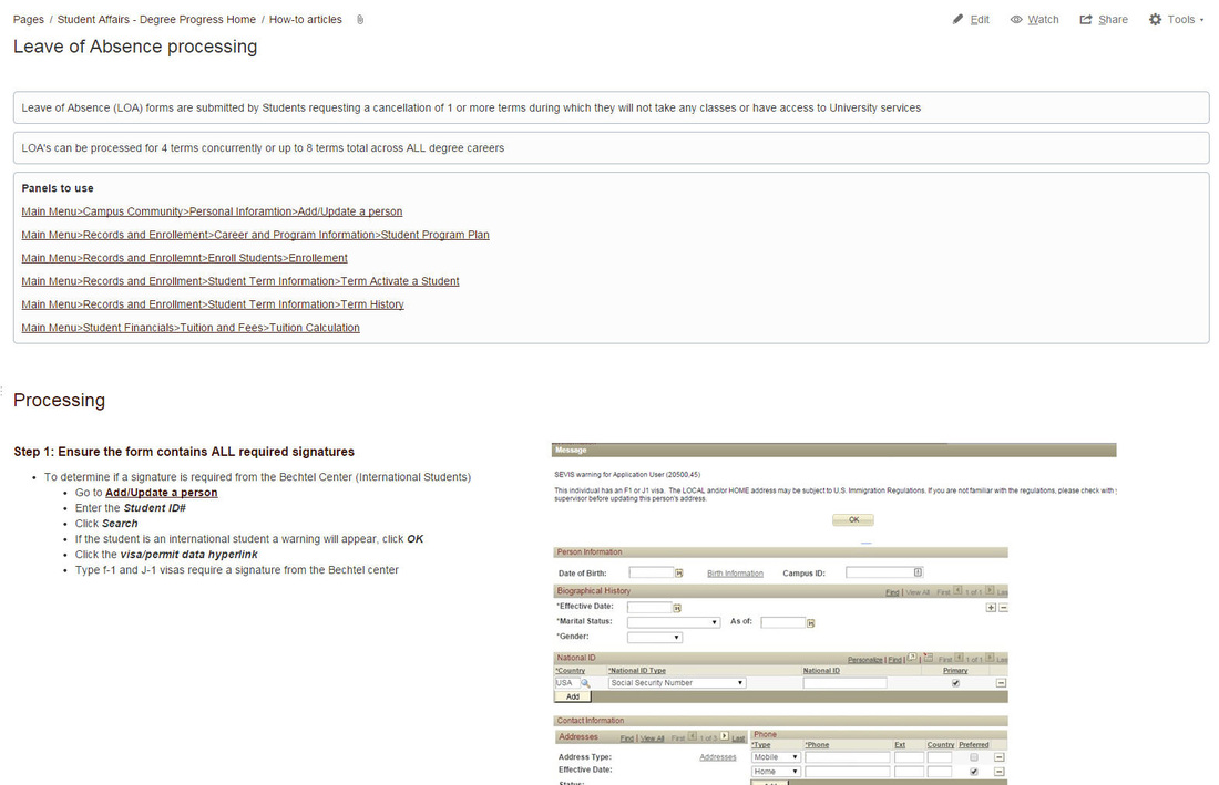
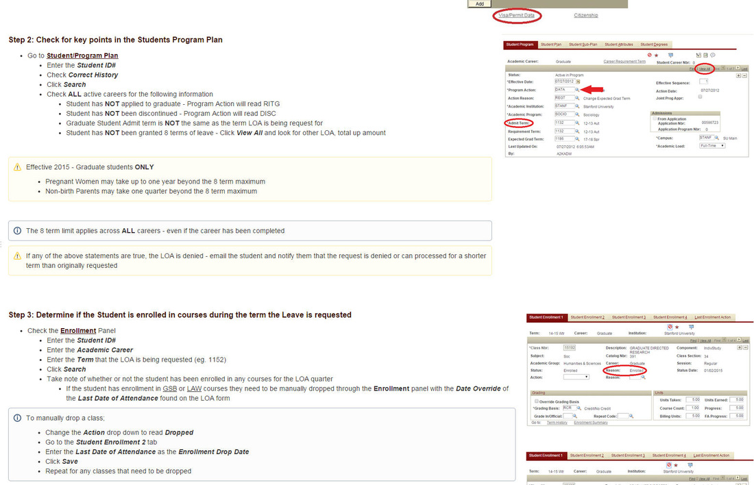
The above screenshots show the start of the project in creating a blank page in confluence. I'm glad I had detailed a rough sketch of the design, as the blank canvas could be slightly intimidating without a draft design in hand. I then created the additional columns and started to outline each form we oversee by the related process (Enrollment, Test/Transfer Credit/Graduation, etc). From here, the documentation for the Leave of Absence (LOA) process was created (screenshots 4&5 above). I will then link the created LOA page now to the Leave of Absence (LOA) row on the main Degree Progress page for ease of reference moving forward. Note: my options for this post were to include the full view screenshot of the Leave of Absence process, or a snapshot of how columns (text/images) were used. I went for the latter to provide a glimpse of how I hope the documentation will look moving forward.
Overall, I found that my design within Confluence was fairly consistent (albeit more presentable) than my original sketch. I wanted to go for simplicity in the design, to provide staff with a comforting one-stop wiki for access to documentation. This approach is essentially a polar opposite to our current documentation structure, which is similar to a rotten Easter egg hunt. I found the use of Confluence quite intuitive if you have website design experience. The use of the columns and ability to add text/images horizontally helped demonstrate the action with a visual reference. Our current Word documentation has the text/visual representation in vertical fashion, so I hope this small adjustment will help in review. I made a few edits to the order of the forms on the main screen, and will likely continue to make some edits (with plenty of additions for the documentation links). Moving forward, I could consider a list view of all the documents for ease in reference as well. Regarding the actual process, I think it really helped that I sat down with staff initially and went through the process myself of trying to find documentation to draft the simple one page view. I aimed not to overthink the design, and while it can be improved, it does meet the need for accessibility and simplicity. I'm looking forward to building this page out some more and making any adjustments that may assist with form review.
Overall, I found that my design within Confluence was fairly consistent (albeit more presentable) than my original sketch. I wanted to go for simplicity in the design, to provide staff with a comforting one-stop wiki for access to documentation. This approach is essentially a polar opposite to our current documentation structure, which is similar to a rotten Easter egg hunt. I found the use of Confluence quite intuitive if you have website design experience. The use of the columns and ability to add text/images horizontally helped demonstrate the action with a visual reference. Our current Word documentation has the text/visual representation in vertical fashion, so I hope this small adjustment will help in review. I made a few edits to the order of the forms on the main screen, and will likely continue to make some edits (with plenty of additions for the documentation links). Moving forward, I could consider a list view of all the documents for ease in reference as well. Regarding the actual process, I think it really helped that I sat down with staff initially and went through the process myself of trying to find documentation to draft the simple one page view. I aimed not to overthink the design, and while it can be improved, it does meet the need for accessibility and simplicity. I'm looking forward to building this page out some more and making any adjustments that may assist with form review.