Problem of Practice: A simplified Documentation Portal to Assist in student form processing
Overview
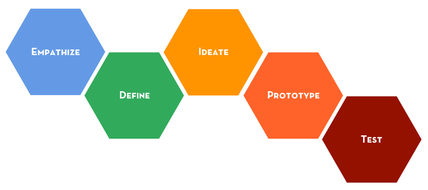
The result of my problem of practice project is a documentation portal that allows staff to reference screenshots and directions when processing student form requests. The design arose after an initial identification of a high volume of submitted HelpSU tickets related to student forms that our team had previously processed. In a recent transition to a management role within the degree progress team in Office of the University Registrar, I noticed that the incoming tickets were related to steps performed during the review and processing of student forms. We currently oversee twenty-six student forms, in which the process for each form varies, as does the process for each student population (undergraduate, graduate or coterminal student). With this broad issue identified, I progressed through the Stanford Design Model thanks to the guidance of the CEP 817 instructors and course content, to develop a documentation portal that allows staff to reference key steps when processing these twenty-six forms.
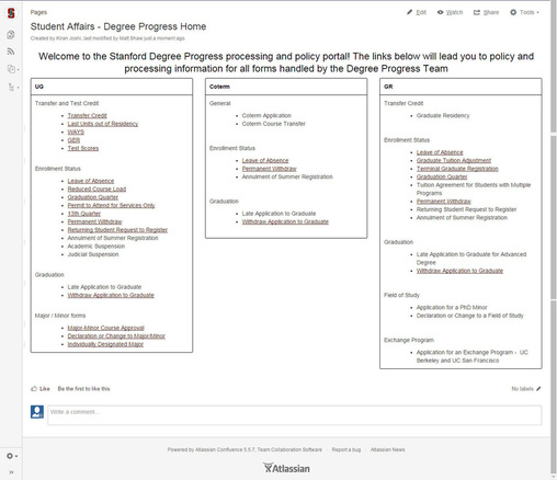
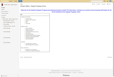
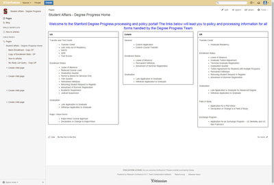
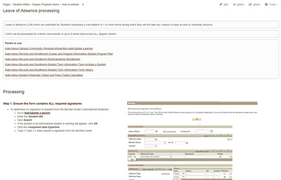
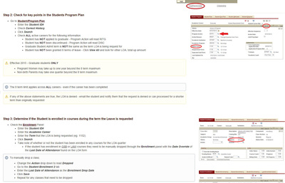
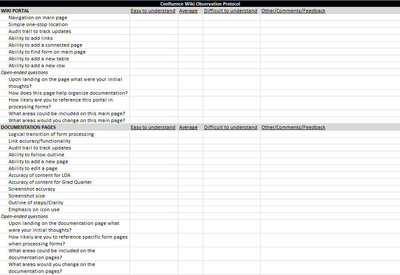
The “final” design for the problem of practice project is displayed below, which displays a single landing page for all degree progress related forms, organized by career. Staff members can now easily find documentation for each form, and the steps specific to undergraduate, graduate or coterminal students. In addition, links from the main portal will take staff members directly to the directions and screenshots required to process the forms. Within each section of the form pages are key reminders that are often skipped, which result in the submitted help tickets, such as a required tuition calculation or student group tag. The purpose of this design was to immediately address staff concerns with accessing form documentation, while also providing a universal landing page to house the documentation for ease of reference. Please see the additional sections focused on the Stanford Design Model phases below for more insight on my thought processes below.
Lastly, longer term implementation goals such as form automation are already on the agenda for future rollouts, but in the four month period for which CEP 817 covered, I wanted to tackle an area in which I could make an instant impact, without relying on a technical team for advanced programming and coding. The documentation portal has provided staff with a reliable resource with visual references to confirm processing steps if questions arise. In the phases below, I have outlined my design decisions and thought processes through each stage of the Stanford Design Model, with the documentation portal still being improved upon as we speak.
Empathy
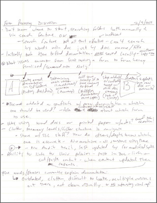
As I began the project I had a brief idea of the issue at hand, but had no real understanding of why forms were being processed incorrectly. I had assumptions: system errors, user errors, or student errors in reviewing their records, etc., but wasn’t able to pinpoint these issues until I spent time with my team directly. I spoke with two individuals who handle a majority of our form processing, with a focus on observation and interviewing as two techniques to understand the users’ concerns. First, I interviewed a team member on why he thought we were running into these issues, and it was clear that when questions arose, he had trouble referencing accurate documentation or guides in processing these cases. He mentioned previous issues of scattered files on our server folder, outdated files that were inconsistent amongst revisions, and often times the inability to locate any documentation for a certain process. I also sat down with another staff member to observe her steps involved when processing forms. If a unique case arose, she would browse our server folder to no avail, and when using the search feature found multiple copies of the same document, with conflicting steps from user modifications over the years. What hit me personally was how frustrating this was for the staff members; not only did they have a high volume of forms to review (in which data entry is involved) on a daily basis, but when they run into an issue, they do not have a clear direction in providing help. I felt frustrated on their behalf, and upset that they didn’t have anywhere to turn to besides asking questions of their colleagues when a question arose. Thankfully I was able to see this frustration through observation and interviewing, but also by projecting my own emotions into the situation – this experience was the reason that I knew we had to do something about how staff interact with our forms; we had to make a process improvement to reduce the errors but also to improve their experiences while at work. Empathizing with my team allowed me to not only see the issues through their eyes, but also experience the frustration required to motivate me to promote change through the design process.
Definition
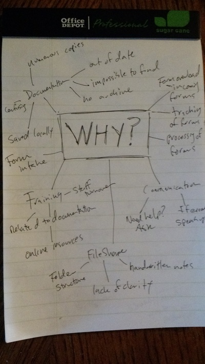
Now that I had seen the processing issues through the eyes of my users, I aimed to define the issue at hand through my own point of view, and to get a better understanding of the “why” these issues were occurring. Through my empathy research it was clear that the documentation nightmare was not providing a clear foundation for staff learning when reviewing these forms. But from my point of view it was not only a clarity issue, but also a resource issue. Staff did not have the resources to easily resolve a question they had, as the current documentation portal (FileShare server folder) was a dysfunctional resource. Throughout the problem definition stage, I found myself relying on the notes/experiences I encountered with my team, and really trying to narrow down the issue to “why” was this issue occurring. I surprised myself at times with the “5 Whys” exercise, as I went beyond my own original thoughts on the why and pushed myself to consider what other causes could be at the heart of my original problem. I felt that I was learning as much about my own thought processes as I was in trying to define the issue at hand.
Ideation
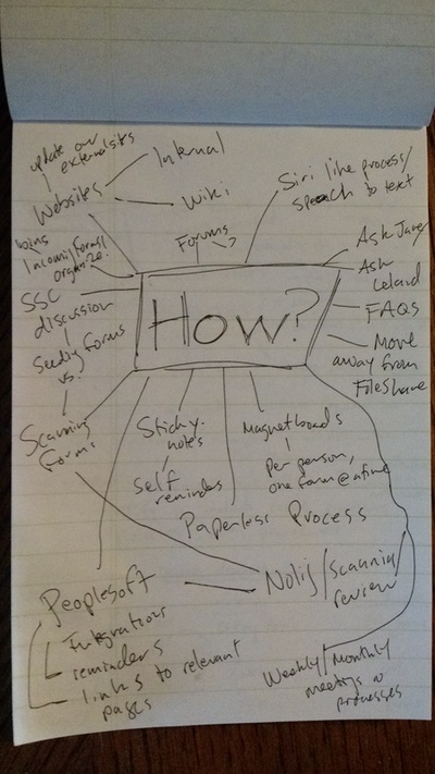
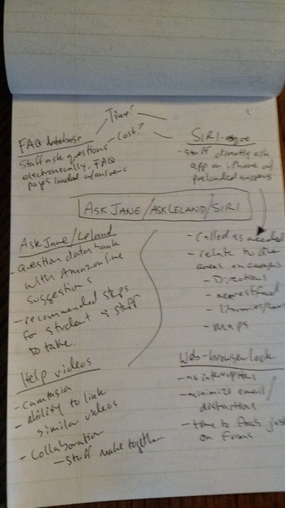
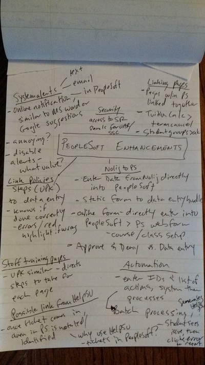
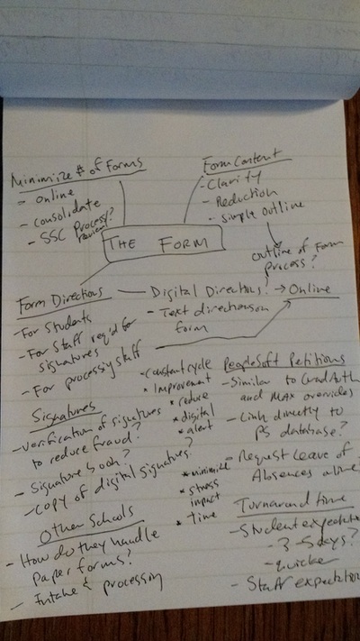
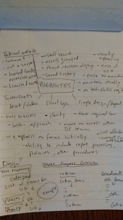
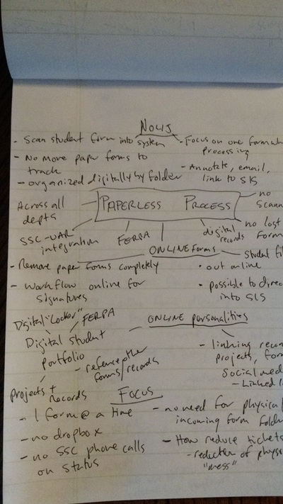
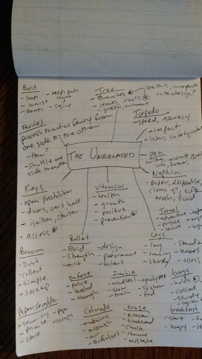
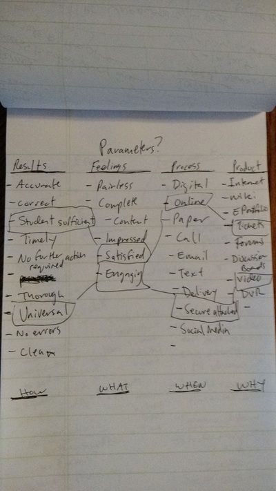
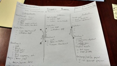
For those with an interest in dreaming of the endless possibilities (like myself), the ideation phase is the phase in the Stanford Design Model in which I found myself constantly thinking about the problem of practice project. I still had no real clue on what I wanted to focus my design on, but I let the ideas flow generously and captured many of them through my own form of “web-flaring” – connecting similar ideas to one main concept outlined on paper. I started the flaring exercises by focusing on why and how the issues were occurring, and then tried to develop different ideas for a design that may minimize the original issue. I drafted ideas for enhancements to the student information system (PeopleSoft), crafted thoughts of a Siri-like platform called AskLeland (named after Leland Stanford Jr), placed emphasis on website development, proposed looking at form specific improvements and also attempted to connect unrelated ideas in a wide-scale flaring technique with different project parameters that could possibly be linked together. By the end of the ideation period, I was able to focus my ideas on the short-term and what was feasible in development without external resources. I placed emphasis on website enhancements to provide staff with a single point of entry to the form documentation, but from here I wasn’t sure on how the design would develop. What I loved about this stage was that there were no wrong answers, no chance of failure only a time period of brain freeze where new ideas may be slower to originate. I was free to connect the unrelated dots and imagine what could be done to resolve this issue. It was a freeing experience to let the mind ideate, innovate and motivate to now build a project prototype.
Prototype
As my project transitioned to the prototype stage, it was now time to physically create a design that built on the users’ needs and focused on the documentation issues outlined in the above phases. As mentioned, I focused on website improvements to provide a one-stop portal for documentation reference, to avoid the painstaking search for accurate information. I narrowed my prototype options to three areas: expansion of the Student Affairs webpage, creating our own section on the Stanford Confluence wiki site, or improving upon the current FileShare server folders. In reflection back on the needs that staff had mentioned, the wiki site provided a secure location for staff to review, modify and create their own content, while providing an audit trail and archive of form process updates. The wiki site also allowed for documentation to be outlined by screenshots and directions all within one horizontal page for ease of understanding. While I was still rather unsure about the design in this stage, I felt that I was making progress and kept referencing my notes from the empathy stage. I didn’t know what would come next when creating the main page portal and a form page for the ‘Leave of Absence’ form, but knew that my design must reflect the needs identified in the earlier stage. From reading articles on failure as a step towards growth, I knew that my design was not perfect (or even far from it), but that it focused on my users needs and the concerns they addressed from day one. If nothing else, my goal was for the prototype to be an improvement in their current experience with form processing.
Testing
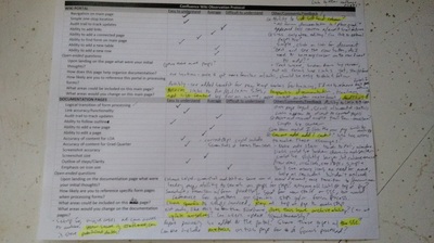
The opportunity for users to test the prototype had finally come, after four months of drafting, developing and revising ideas to resolve the originally identified issue. From reviewing the course content material, I knew this wasn’t the end, but it was the culmination of a learning process for which I was most proud. I had not only tackled an issue that my team was facing, but created the first draft of a process improvement for their benefit, all while growing into a capable designer! I mimicked the empathy stage in my testing design, to revisit the approaches I took when first working with my team in understanding their concerns when processing forms. I interviewed a staff member about their thoughts on the new Confluence wiki portal and gathered valuable feedback that will assist in future revisions of the wiki site. I also observed staff using the portal when processing forms, and answered questions and took notes along the way. Again, I have more work to do in improving the site, but it was a rewarding experience to know that change is in place for a reduction in errors and improved morale within my team. It may be one small step in the grand scheme of things, but the testing provided additional motivation to revisit the wiki site and grow the portal into a larger resource for all Registrar’s Office staff. Since the rollout just two weeks ago, the Student Services Center is now creating their own pages on the wiki site and is working with our team on future ideas for documentation, reporting and methods to integrate University policies into the portal.
Reflection: Design as a learning process
In reflecting back on the design process as a whole, there are two key components that drive design in my opinion. First and quite simply, is that the foundation of design is learning. The art of identifying an issue(s) with a large scale impact is the first step in learning how to resolve this issue. You must be able to identify an issue, weakness or area for growth before you can solve the puzzle. This likely will be a rather vague issue, in which you don’t know why or how it is occurring, but you know that through design you can improve or resolve the issue. Next, you must understand the users impacted by the current issue(s) and relate to this group through empathy. Empathizing with users can be done through a number of methods, but cannot be faked. You must genuinely “live in their shoes” and learn through the eyes of your target user group while attempting to understand the impact of the issue.
From here, the designer takes his/her findings and defines the issue at hand, understanding the “why”, “how” and “what” for the foundation of design, molding his/her own point of view on the purpose for design. The problem definition then allows the designer’s mind to hopefully swell with ideas and possibilities through flaring techniques in the ideation stage. The designer is learning more about the endless possibilities and what could be done, connecting what may previously have been unconnected dots, and seeing no limitations to the design possibilities. Much like the empathy stage, the goal is to put the designer outside of his/her comfort zone to truly generate new ideas that may seem farfetched, but that may also hold the key to innovation.
With these new ideas drafted, the designer learns how to focus his/her ideas towards creating a prototype that can be molded towards the user’s needs outlined in the empathy stage. As the prototype develops, the designer is reflecting back on what he has learned in the previous stages and physically creating the proposed solution. The product or service is now ready for testing with a user group, in which the methods used can be similar to those found in the empathy stage. Even in the proposed ‘final’ stage we are still learning about our user’s needs and how the prototype meets those needs. While the testing stage may be the ‘final’ stage, it is hardly the end; we will make revisions based on what we have learned in the testing phase and repeat the previous steps in perfecting our design. As noted over the semester-long course, design is a learning process, in which each phase offers learning opportunities about the users, the issue at hand and ourselves as designers. We must not only understand the “who” and “why” of the design, but also challenge ourselves as designers to go beyond the current possibilities, and let ourselves encounter failure.
Tying to the point above, the second key component that I’ve learned through the design process is that failure is a sign of progress. We so often have been told that failure is the end and that failure is notated with a failing grade. But with design, failure means the creation of additional opportunities for growth and learning could be right around the corner! We should not be afraid to fail, as it means we are pushing boundaries, both personally and developmentally in our design. If the design doesn’t work or fails through the testing phase, we haven’t failed at the end of the model; we have provided ourselves with a stepping stone to then cycle back to the empathy/definition/ideation phases to tackle the issue with the help of our user group. Design and failure are so closely tied together that we must find comfort in each, for failure is just another component of the learning process.
So with that, thank you to all those of you who provided comments and feedback over the last four months in review of my problem of practice. It was a fun journey and I look forward to many future design projects to build on what I’ve learned during this problem of practice project!
